Castle Rock Brewery
SERVICES
POS Design
Packaging Design
Brand Identity
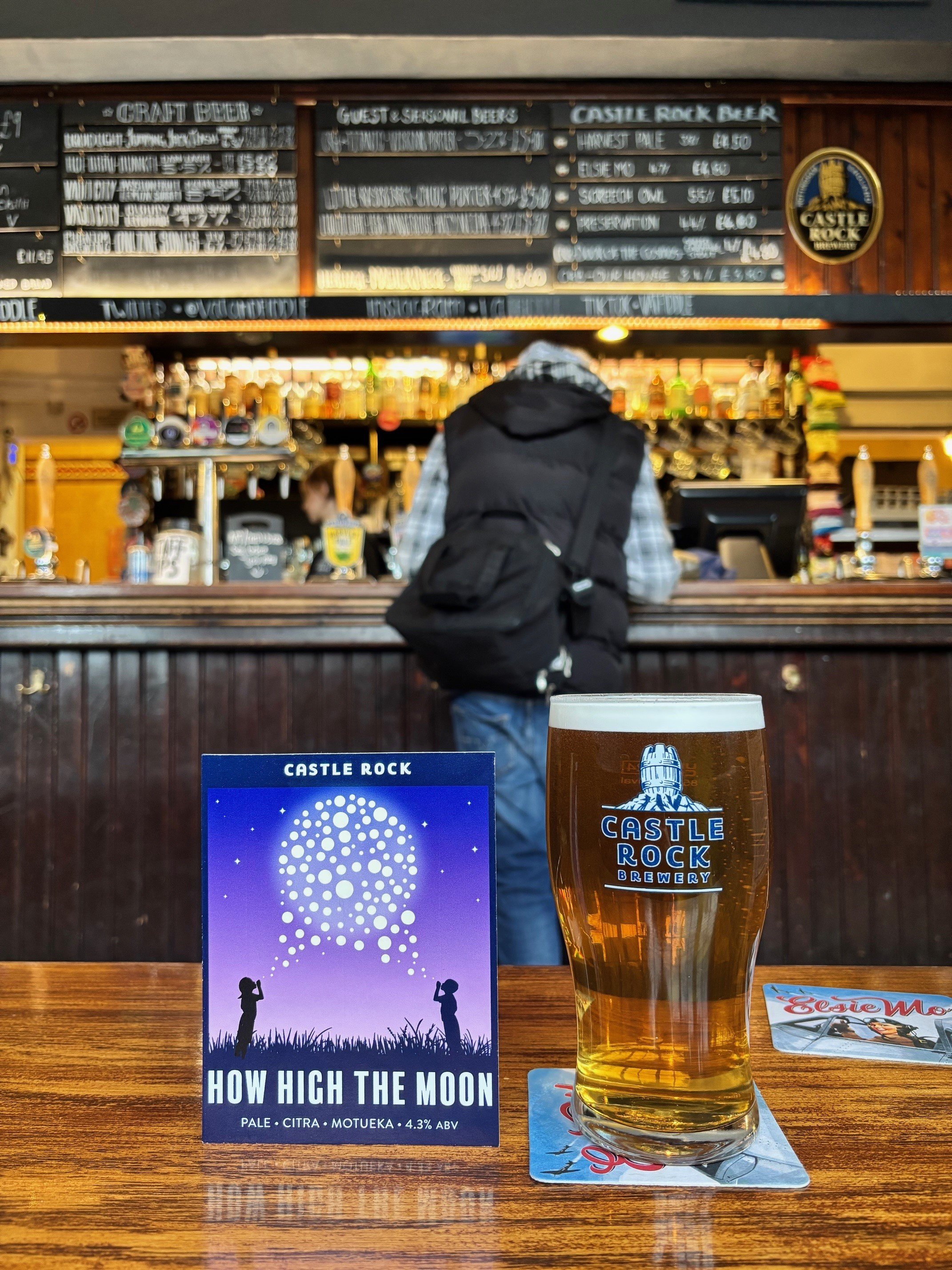
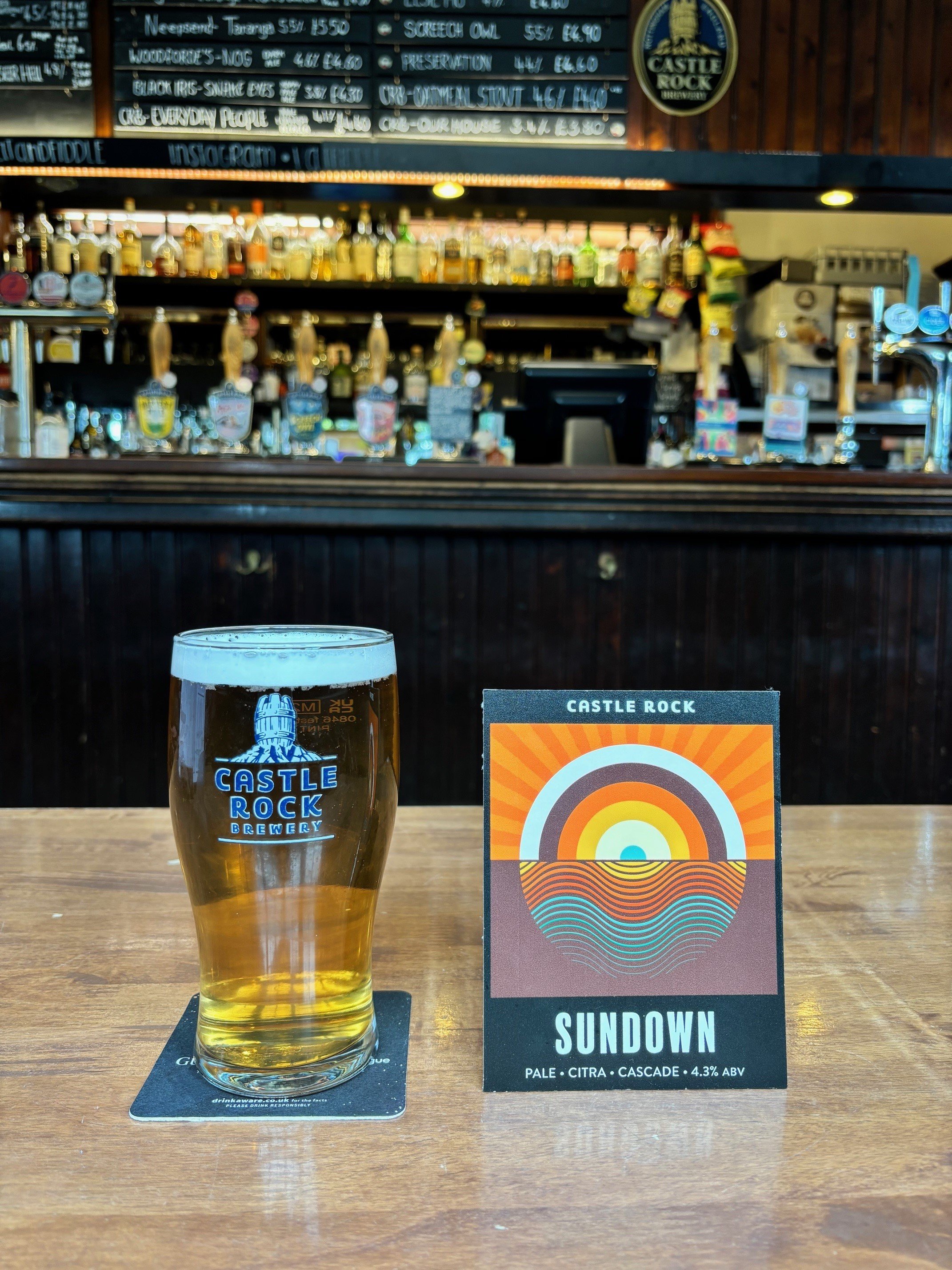
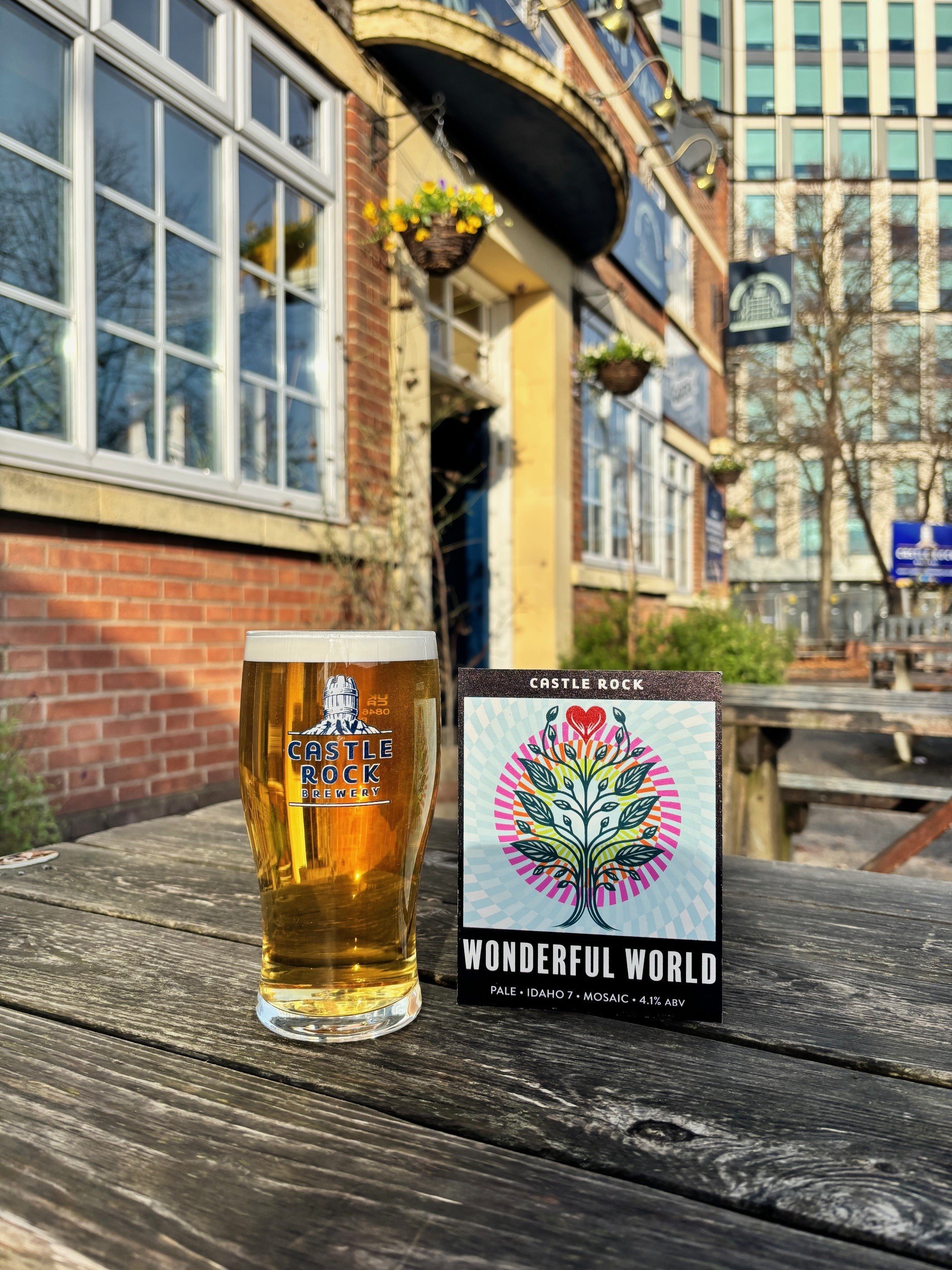
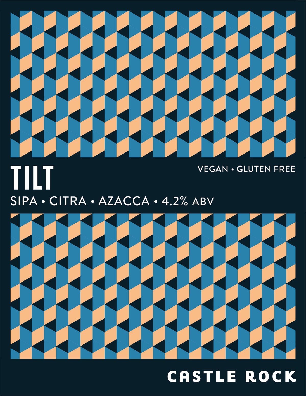
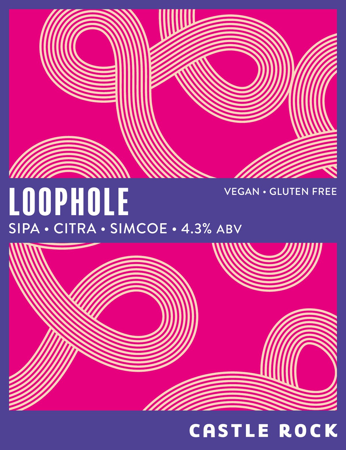
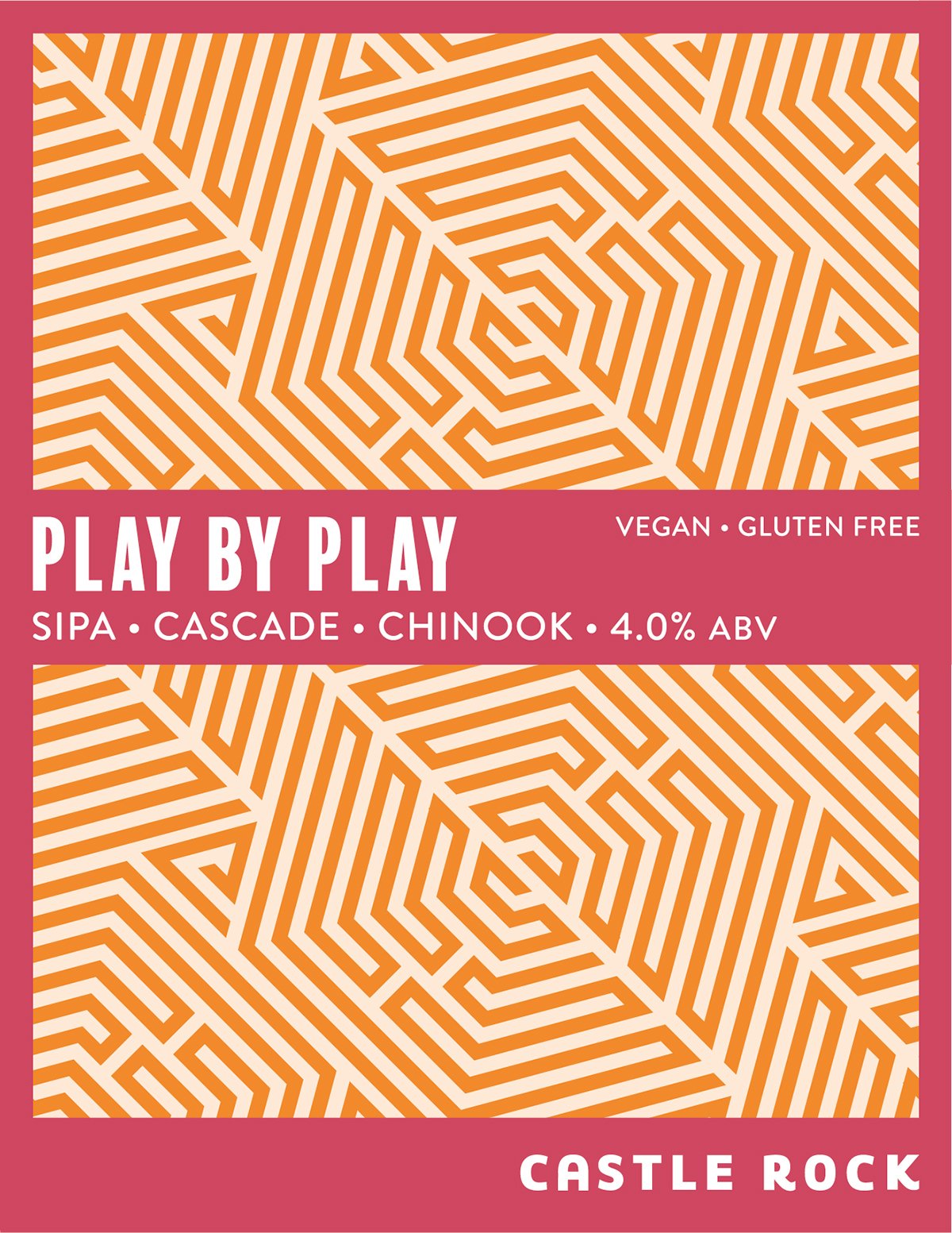
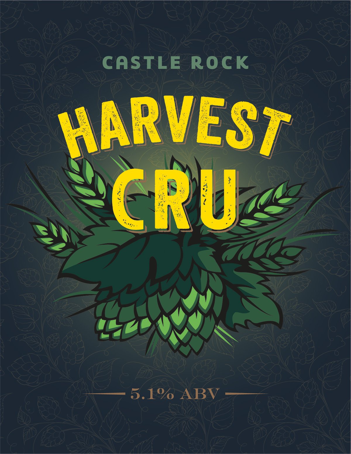
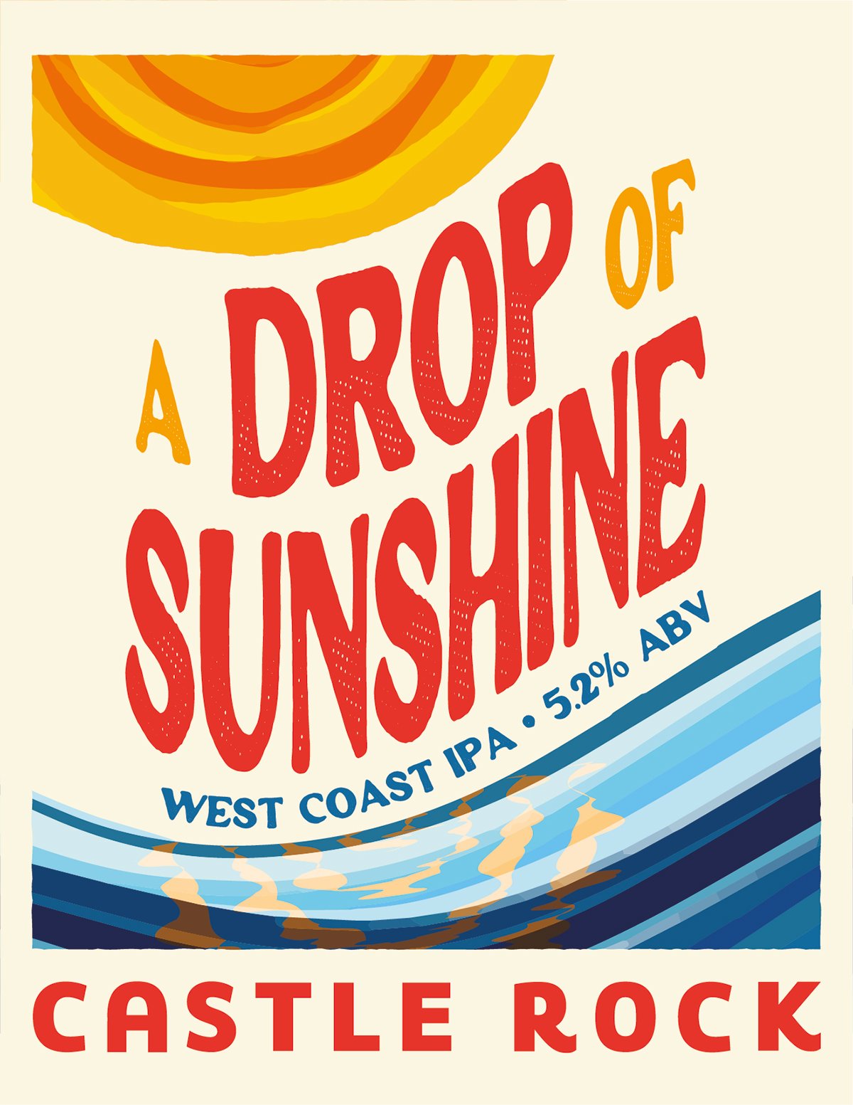
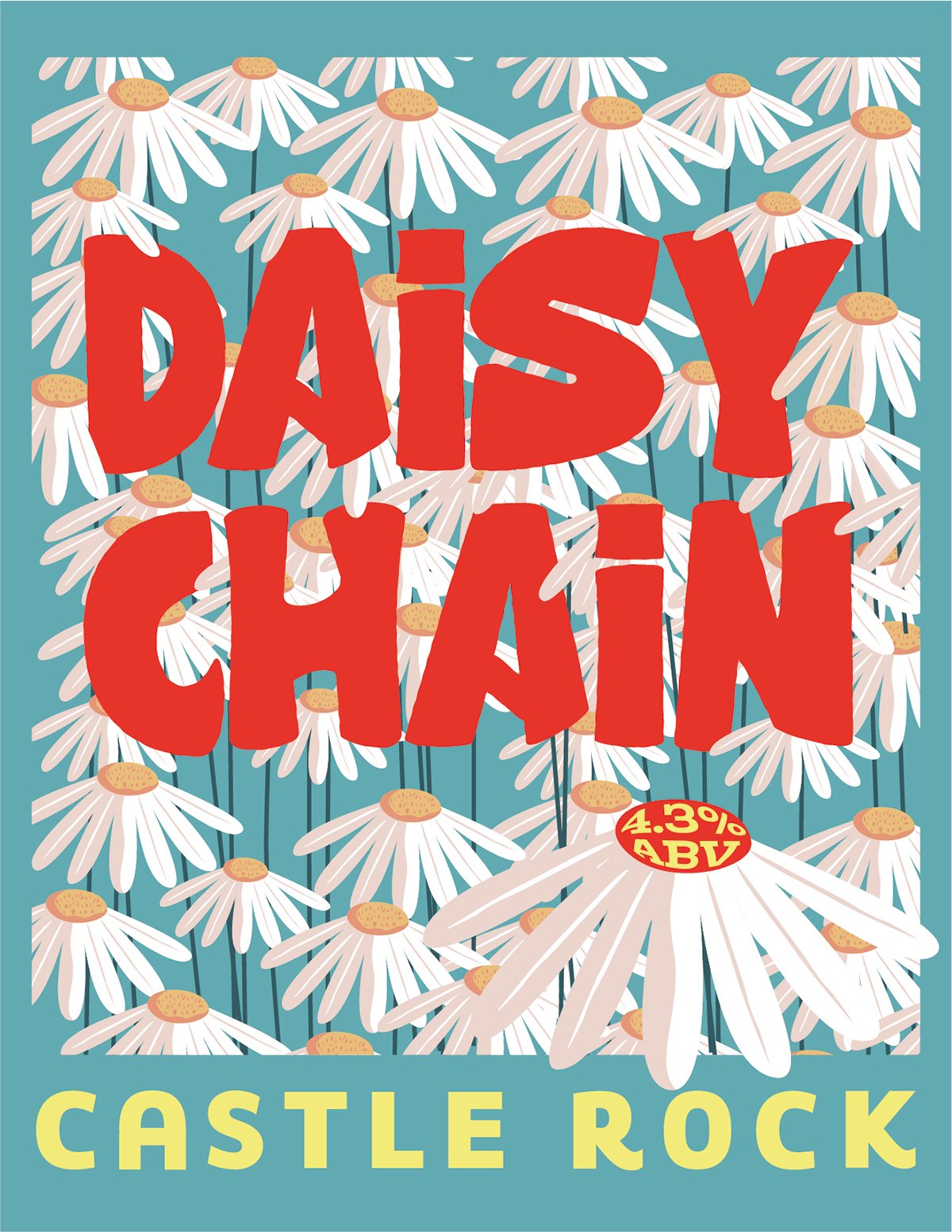
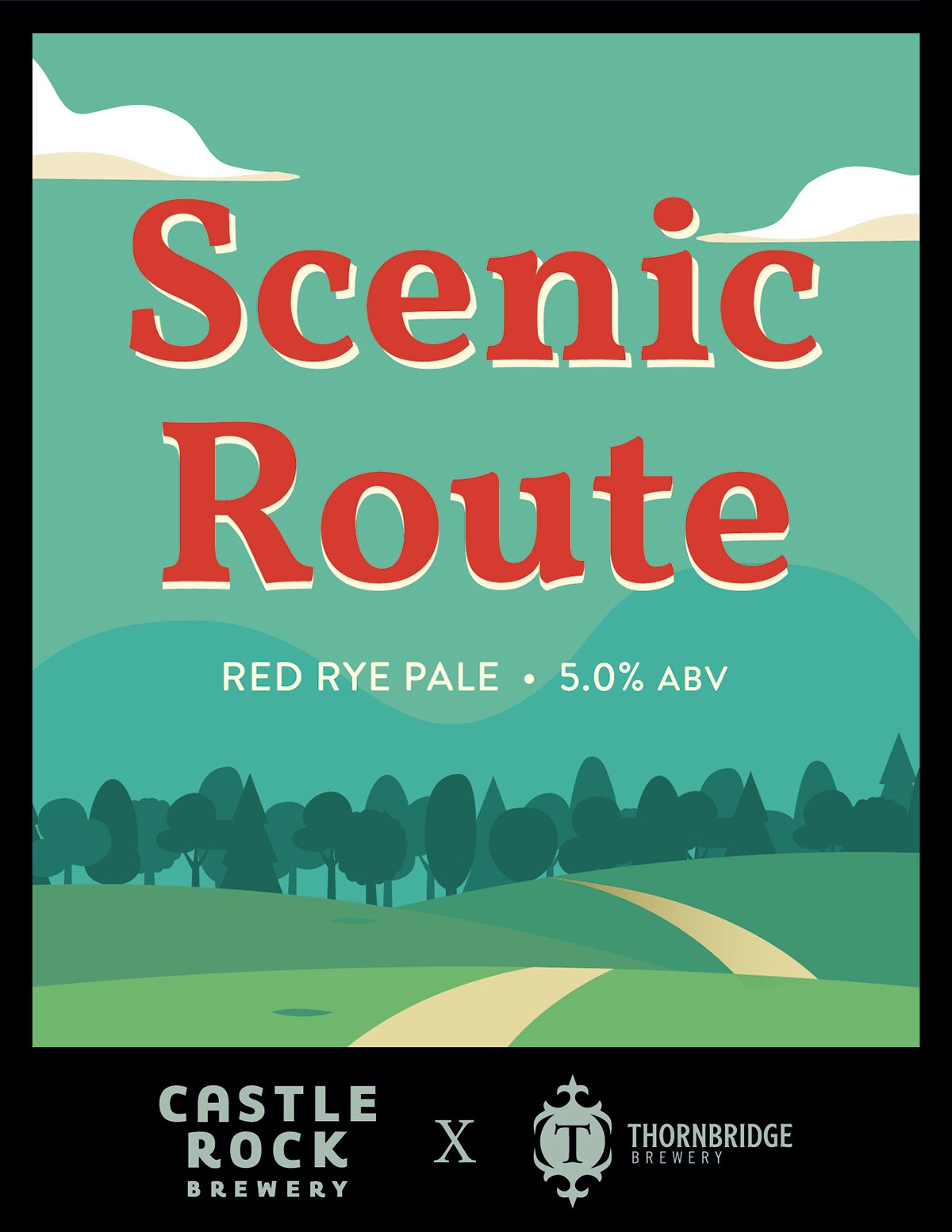
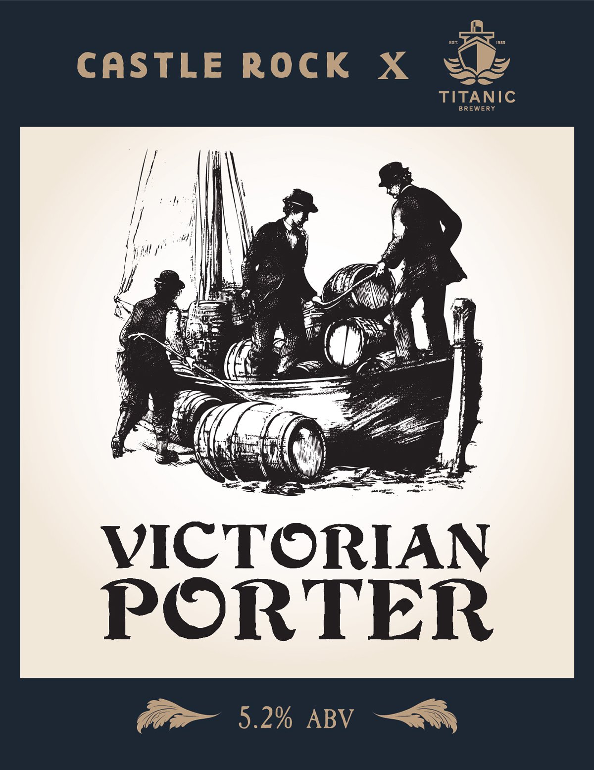
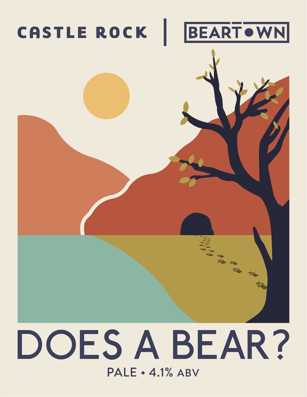
For Castle Rock Brewery, I approach the pump clips and can labels as tactile storytellers. The goal here is to ensure that each design is unique and eye-catching, while remaining entirely legible and approachable. I always start with the primary function of the pump clip—quick recognition at the bar—making sure the design works hard to be both instantly clear and visually inviting. I’m always mindful of staying true to Castle Rock’s brand identity—making sure every design choice, from typography to texture, aligns with their tone, heritage, and visual language.
For the rotating series of dry hop pales—each named after a song title—the designs lean towards the abstract, drawing visual cues from melody, lyric, and mood to create label art that feels intuitive rather than literal. Whether it’s a jagged motif echoing a post-punk riff or a soft colour wash inspired by a shoegaze ballad, each can becomes a fleeting, interpretive homage—more mixtape than manual.
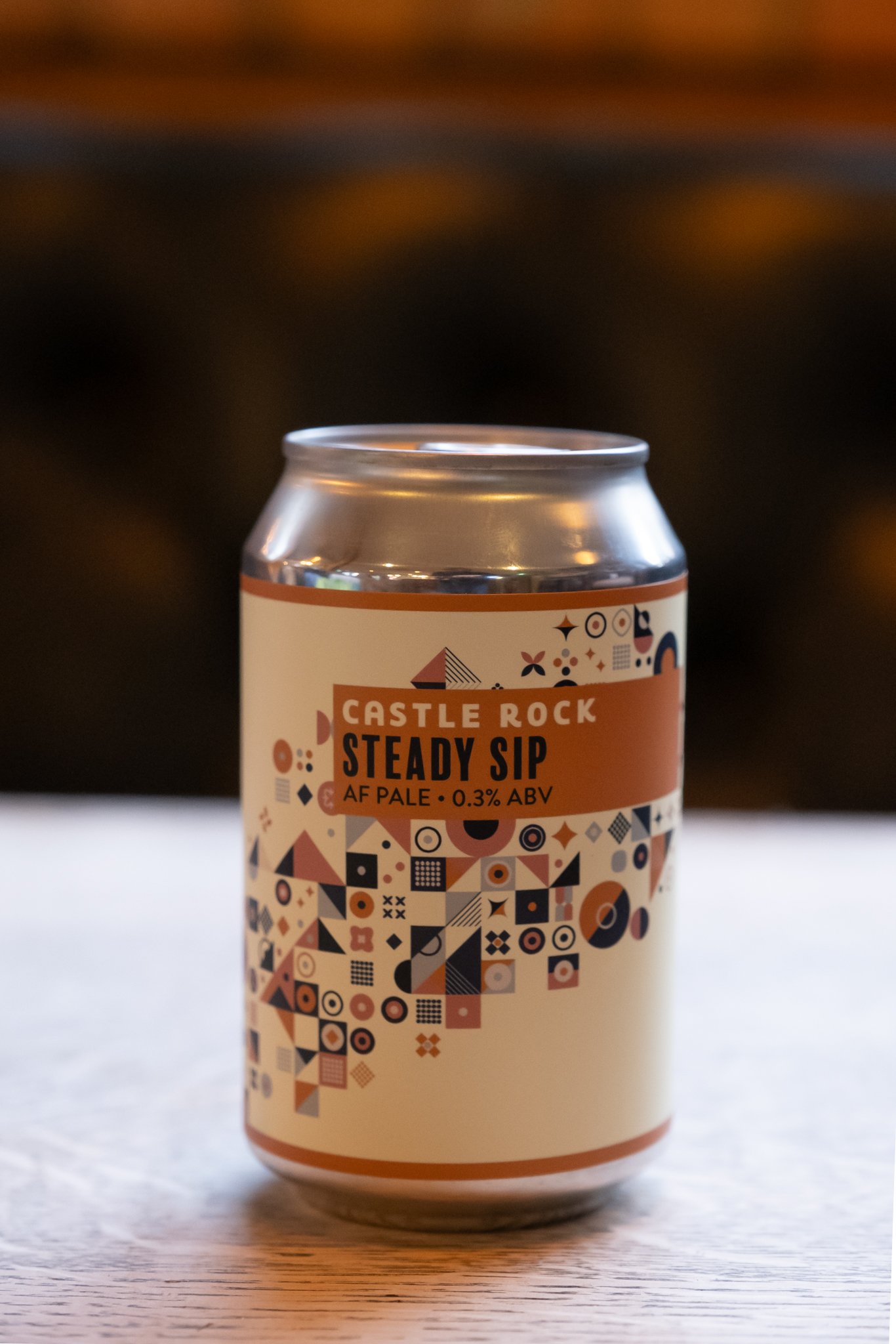
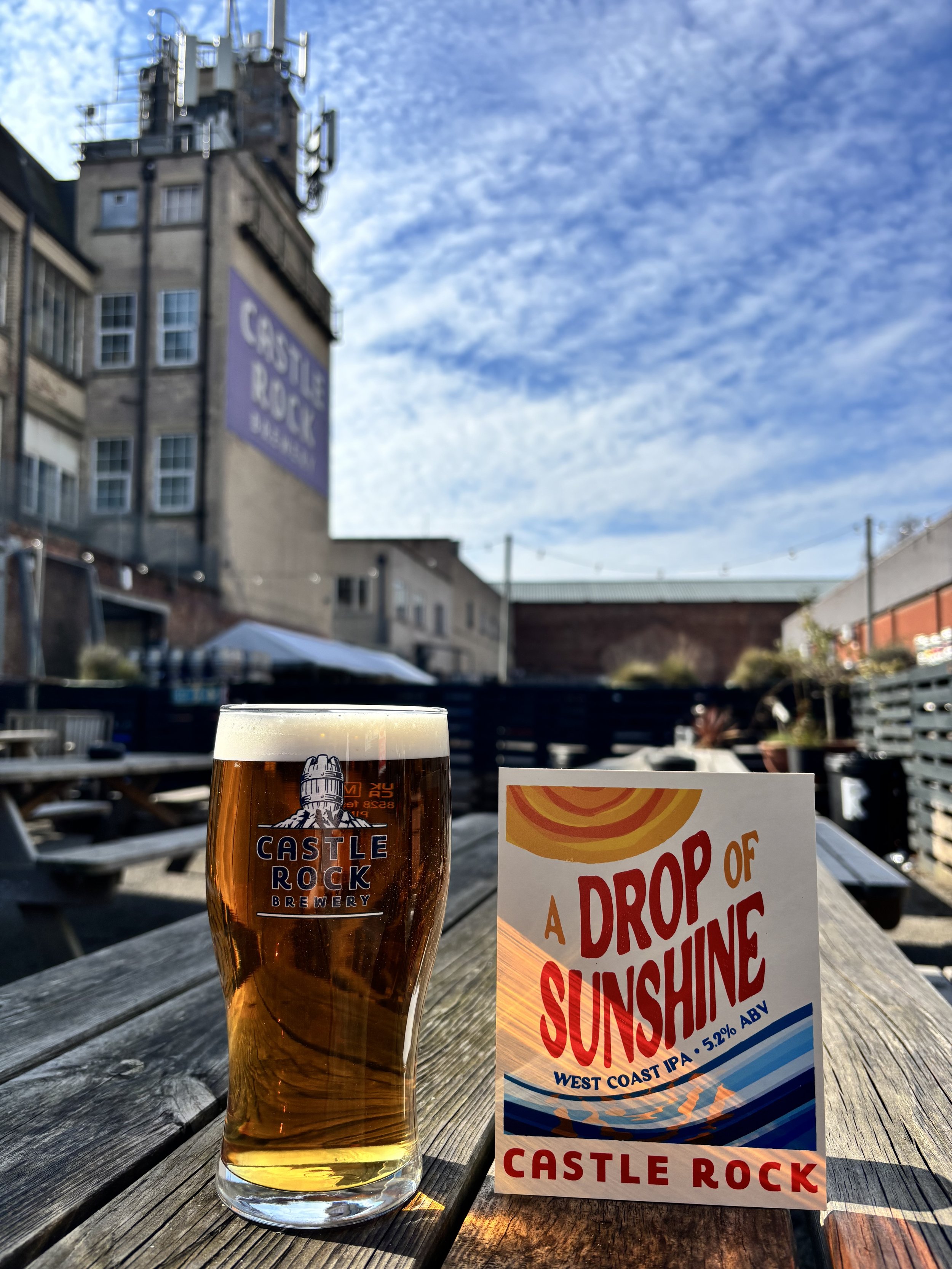
For the session IPA range, the artwork takes on a clean, minimalist approach—built around geometric forms and subtle repeating patterns that reflect the beer’s crisp, sessionable character. In contrast, the collaboration brews offer space to play, giving me artistic freedom to fuse Castle Rock’s grounded visual language with the personality of each partner brewery—resulting in designs that are bold, varied, and full of character, while still feeling part of the same family